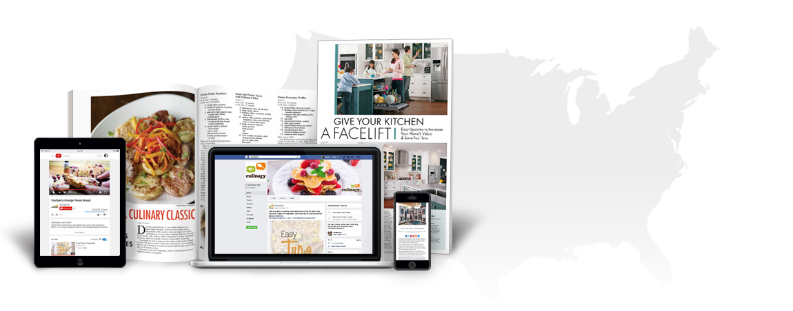


 Photos are the rock stars of design. They should always catch the spotlight, front and center. They grab attention. They make or break a layout. As readers, our eyes are automatically drawn to the color and structure that appears within an image. Here are a few things to check before sending in photos readers love.
Quality
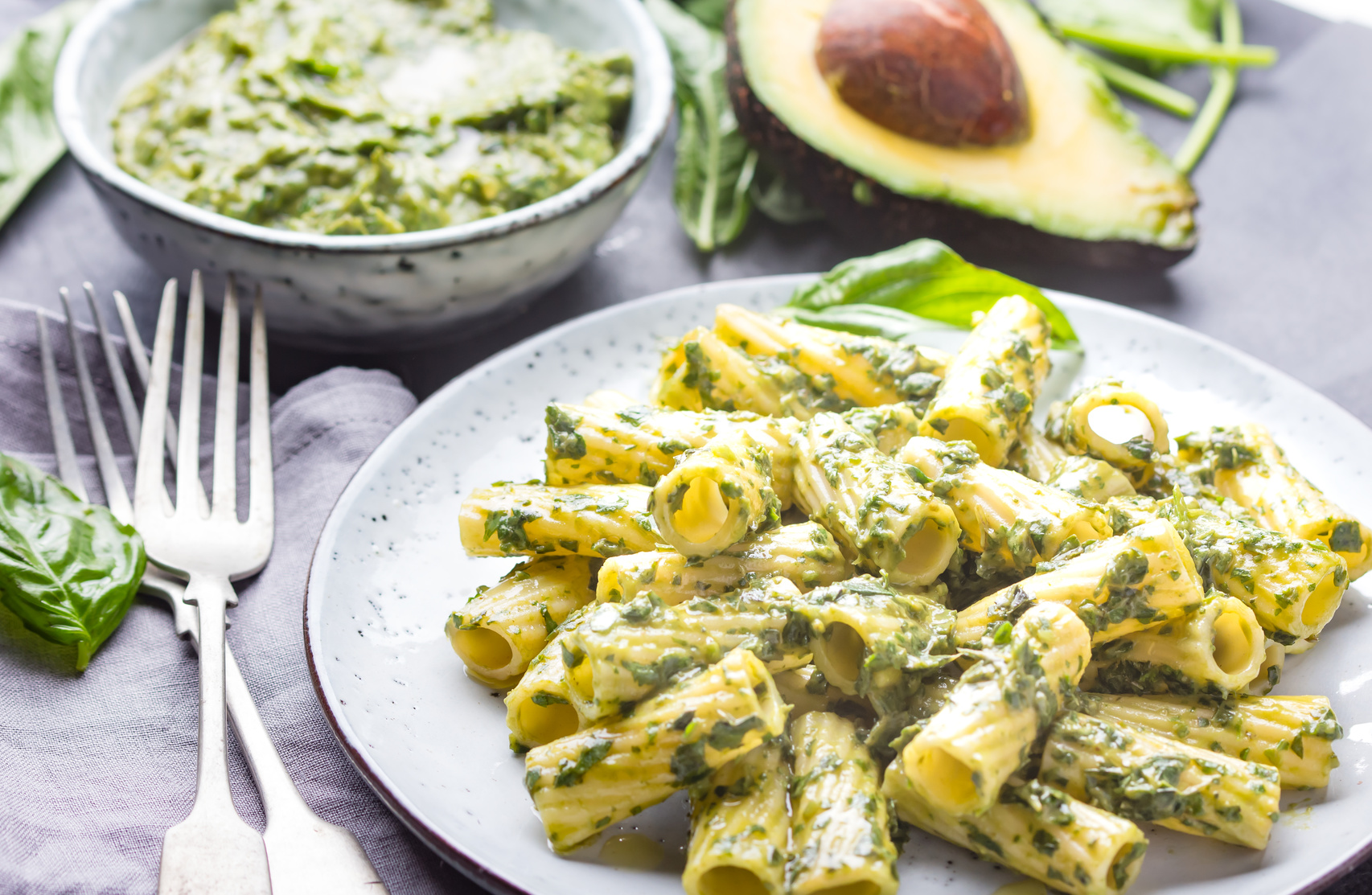
No one likes sloppy and grainy photos. Blurry and over-sharpened are a no-go as well. That means size and especially photo quality matter. Think about what is going to work best for magazine and newspaper editors. This includes food photos that make you hungry and that illustrate the recipe well. When taking a photo, lighting is a huge factor in quality. It usually works best when food is well lit primarily from the front
Size
Main photos for full-page features are large because they’re designed as section front pages. This is where newspapers and magazines typically include large photos in full color to attract readers to the page.
Composition
When dealing with food, it’s best to have individual recipe photos rather than a shot with multiple foods in it. It’s also a good idea to add appropriate propping like a garnish, napkin or flatware. This can draw people in with an added pop of color. Another tip: make it look natural. The crumbs are OK. Don’t sweat it. We want it to look as appetizing and as real as possible.
Other general guidelines for food photography:
• Photos are best without people in them
• Angles and diagonals can make photos more interesting
• Avoid extreme overhead shots
• For holiday themed projects-propping will enhance photos
The extra attention you pay to providing high quality, appetizing photos encourages editors to use your content and will generate more media placements for your clients.

Haley Vickers
As an Editorial Assistant, Haley uses her past journalism experience and editing skills to help create content, edit content and prepare files for online distribution for Family Features. She is a recent graduate, earning a Bachelor’s of Science in Mass Media: Multimedia Journalism from Northwest Missouri State University.